How Do I Check Mobile Friendliness of My Website?
To check mobile friendliness in 2026, run your URL through Google PageSpeed Insights, audit it with Lighthouse in Chrome DevTools, preview breakpoints in DevTools device mode, review the Core Web Vitals report in Search Console, then confirm everything on a real phone. Google retired its standalone Mobile-Friendly Test in December 2023, so these are the tools that replaced it.
Google retired its standalone Mobile-Friendly Test in December 2023, but you can still verify mobile-friendliness for free in 2026. Run Lighthouse or PageSpeed Insights for a mobile score and Core Web Vitals, use Chrome DevTools device emulation to inspect layout at real viewport sizes, and read the Core Web Vitals mobile report in Google Search Console. Those three replace the old test and surface the failures that actually cost rankings: slow LCP, layout shift, undersized tap targets, and missing viewport tags.
Which mobile-friendly checkers still work in 2026
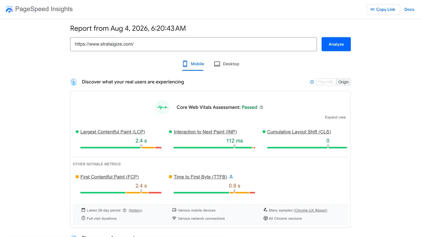
The advice to “run Google’s Mobile-Friendly Test” is dead. Google announced it was sunsetting Search Console’s Mobile Usability report, the Mobile-Friendly Test tool, and the Mobile-Friendly Test API starting December 1, 2023, and the sunset was confirmed in public coverage on December 4, 2023. Google’s stated reason in that announcement: mobile usability remains part of its page experience guidance, but other resources have emerged since 2015, “including Lighthouse from Chrome.”
Google also scrubbed every mention of the tool from Search help docs on December 1, 2023 and redirected Search Console mobile usability URLs to the property overview. In the December 2023 sunset announcement, Google points people at Lighthouse as the replacement. Any guide still linking to the test as a live tool has not been touched since 2023.
One thing did survive: Bing’s Mobile Friendliness Test Tool is still live and still returns a pass or fail verdict with explanations. Run it yourself and the result page enumerates the checks it aggregates into that one judgment: viewport configuration, page content width, text readability, tap-target spacing, and incompatible plug-ins. That matters more than it used to, because ChatGPT’s web results route heavily through Bing.
| Tool | Cost | What it measures | Limits |
|---|---|---|---|
| PageSpeed Insights | Free | Lab Lighthouse mobile run plus real-user Core Web Vitals | Field data needs traffic volume; shareable report links persist as snapshots for up to 30 days |
| Lighthouse in Chrome DevTools | Free | Mobile-emulated performance, accessibility, best practices, SEO, tap targets | Lab only; results vary with your machine’s load |
| Chrome DevTools device mode | Free | Layout, overflow, and fixed elements at real viewport sizes | Emulation, not real hardware or real touch |
| Search Console Core Web Vitals | Free | Site-wide mobile field data grouped by URL group | 28-day rolling window; no tap-target or viewport checks |
| Bing Mobile Friendliness Test | Free | Viewport, content width, readability, tap spacing, plug-ins | Bing’s verdict, not Google’s ranking input |
| Real devices or BrowserStack | Free tier, paid plans | True touch, gestures, browser rendering quirks | Device breadth costs money and time |
| Google Mobile-Friendly Test | Gone | Nothing | Retired December 1, 2023 |
Why this now decides indexing, not just ranking
Mobile-first indexing finished later than most guides claim, and Google’s mobile-first indexing documentation is now the whole story: Search crawls and indexes with Googlebot Smartphone, and content that is not accessible on a mobile device cannot be indexed. The last sites still crawled by desktop Googlebot were moved across in July 2024. Googlebot Desktop still appears in logs for a few features such as product listings and Google for Jobs, but for organic ranking the mobile render is the only render.
Want expert eyes on your site instead of another audit tab? See our website optimization services.
Run a mobile audit with PageSpeed Insights and Lighthouse
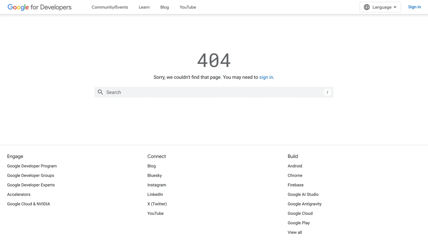
Start with PageSpeed Insights. Paste a URL, run it, and read the Mobile tab before the Desktop tab.
The report splits into two halves that people constantly confuse:
- Field data at the top: real Chrome user measurements from the Chrome UX Report, updated daily on a rolling 28-day window. This is what Google’s page experience signals actually use.
- Lab data below: a single simulated Lighthouse run on Google’s servers. Useful for diagnostics, not a verdict on real users.
A page passes Core Web Vitals only when it meets the good threshold at the 75th percentile of page views for all three metrics. Two out of three is a fail.
| Metric | Good | Poor |
|---|---|---|
| Largest Contentful Paint (LCP) | 2.5s or under | over 4.0s |
| Interaction to Next Paint (INP) | 200ms or under | over 500ms |
| Cumulative Layout Shift (CLS) | 0.1 or under | over 0.25 |
Source: web.dev Core Web Vitals thresholds, current as of 2026. INP replaced First Input Delay as a Core Web Vital on March 12, 2024, so ignore any checklist that still tells you to optimize FID.
Two PSI changes that shifted the goalposts
On December 5, 2024, PageSpeed Insights adjusted its CPU throttling factor, which generally increased Total Blocking Time in mobile lab runs. Field and desktop results were unaffected. If your mobile lab score dropped and nothing shipped, that is a plausible cause.
PSI and its API moved to Lighthouse 13.0 on October 20, 2025. Google also plans to stop returning CrUX real-world data through the PageSpeed Insights API and points automation builders at the CrUX API or CrUX History API instead. If you monitor at scale, note the PSI API quota published in Google’s own API documentation: 25,000 queries per day, capped at 400 queries per 100 seconds.
Running Lighthouse locally
Lighthouse ships inside Chrome DevTools. Open your page, right click, choose Inspect, open the Lighthouse panel, select Mobile, then click Generate report. It runs against your installed Chrome and never beacons results to a remote server, so you can audit staging and password-protected builds that PSI cannot reach.
The mobile preset is not a guess. Lighthouse applies a 4x CPU slowdown multiplier to drag a desktop CPU into mid-tier mobile range, plus a “Slow 4G” network preset that represents the bottom quarter of 4G connections. Device emulation uses a Moto G Power profile at a 412 by 823 viewport with 2.625 device pixel ratio, mobile and touch enabled.
Two version notes for 2026. The latest release is Lighthouse 13.4.1, dated July 20, 2026. And Lighthouse 13 replaced the old audit list with DevTools-aligned insights, keeping unsized-images and non-composited-animations as diagnostics while leaving performance scoring unchanged because it is metric-based. The font-size audit was removed in Lighthouse 13, reflecting Google’s position that it is not a current SEO signal. Legible text still matters for humans and conversions. It no longer shows up as a checkbox.
Chrome DevTools device emulation walkthrough
Scores tell you speed. Emulation tells you whether the page is usable. Run both.
- Open the page in Chrome and press the Inspect shortcut, then toggle the Device Toolbar.
- Pick a narrow viewport first. Test at 360 by 800 and 390 by 844, then step up through tablet widths.
- Set throttling to Mid-tier mobile or apply Slow 4G plus 4x CPU manually to match the Lighthouse profile.
- Rotate to landscape. Open your main navigation, a form, and a checkout or contact step in each orientation.
- Watch the Elements panel while you resize to find which container overflows.
What emulation catches that a score never will:
- Tap targets sitting under 48 by 48 pixels or crowded against a neighbour, which the Lighthouse tap-targets audit flags
- Horizontal overflow from a fixed-width table, embed, or oversized image
- Sticky headers and cookie banners eating half the viewport on a short screen
- Modals with a close button pushed off-canvas
- Inputs that trigger the wrong keyboard or zoom on focus
Be honest about the ceiling. Emulation resizes a desktop browser and fakes a slow CPU. It does not reproduce real touch latency, iOS Safari quirks, thumb reach, or the way a mid-range Android handles a heavy script under thermal throttling. Finish every audit on an actual phone. That last five minutes catches the bugs that cost conversions.
Reading Core Web Vitals mobile data in Search Console
The Experience section changed shape. Mobile Usability is gone, the Page Experience view became a page that links to Google’s guidance plus a dashboard of the Core Web Vitals and HTTPS reports, and Core Web Vitals is where mobile diagnostics now live.
Open Search Console, go to Core Web Vitals, and work the Mobile report. Google splits the overview by device, groups URLs that deliver similar experiences, and assigns each group the status of its worst-performing metric. So one bad metric on a template drags every URL in that template into Poor.
How we read it:
- Click Open report next to the mobile chart, then toggle the Poor, Needs improvement, and Good tabs.
- Read the “Why URLs aren’t considered good” table. It names the failing metric and the threshold breached.
- Fix the template, not the URL. Group-level status means one template fix moves many pages.
- Use Start Tracking after deploying. Google runs a 28-day monitoring session and marks the issue fixed only if it stays absent for the full window.
Two caveats worth internalising. The data is a rolling 28-day aggregate, so a fix shipped Tuesday will not show Wednesday. And Google states plainly that PageSpeed Insights data might vary from the Core Web Vitals report, because one is a lab run on one device profile and the other is thousands of real sessions. When they disagree, trust the field data and use the lab run to find the cause. web.dev explains the lab versus field split in more depth. The same metrics sit inside how we approach website optimization.
Most common mobile failures and fixes
These are the failures the tools above are built to catch, with the threshold or rule each one uses.
| Failure | Detected by | Threshold or rule | Fix |
|---|---|---|---|
| Missing or misconfigured viewport meta tag | DevTools emulation, Bing test | Desktop layout forced onto a phone | Add <meta name="viewport" content="width=device-width, initial-scale=1"> |
| Slow hero LCP image | PSI field and lab, Search Console | LCP must be 2.5s or under at p75 | Compress, serve modern formats, preload the LCP element, drop lazy loading on it |
| Images and embeds without dimensions | Lighthouse unsized-images diagnostic | CLS must be 0.1 or under at p75 | Set width and height or aspect-ratio on every media element |
| Heavy third-party JavaScript | PSI lab, Lighthouse | INP must be 200ms or under at p75 | Defer, remove, or gate scripts; break up long tasks |
| Tap targets too small or too close | Lighthouse tap-targets audit | Targets under 48 by 48 pixels get flagged | Enlarge buttons, add spacing between adjacent links |
| Content wider than the screen | DevTools device mode, Bing test | No horizontal scroll on a 360px viewport | Fluid tables, max-width: 100% on media, no fixed pixel containers |
| Intrusive interstitials | Manual check on a real phone | Content blocked on load | Delay, shrink, or remove full-screen popups |
| Late-loading fonts and injected banners | Search Console CLS group | CLS at p75 | Preload fonts, reserve space for banners and ads |
Notice which tool detects what. No single checker covers the list, which is exactly why the old single pass or fail badge was never enough.
The audit we run, step by step
Here is the sequence we use on our own site and on client sites, in order.
- Pick three URLs, not one. Homepage, a top service or product page, and a blog post. Templates fail differently.
- Search Console first. Core Web Vitals, Mobile view. Note which URL groups sit in Poor or Needs improvement and which metric is named. This is real users, so it sets priority.
- PSI on one URL from each failing group. Compare field data to lab data. If field says Poor and lab says fine, look for third-party scripts, logged-in states, or slow origins that a clean lab run never sees.
- Lighthouse locally on the same three URLs. Mobile preset. Read the tap-targets and
unsized-imagesdiagnostics, and the Accessibility panel for contrast failures. - DevTools device mode at 360 by 800. Open the nav, a form, and the primary conversion step. Rotate. Look for overflow and blocked content.
- Bing’s Mobile Friendliness Test on the same URLs for a second crawler’s verdict on viewport, width, readability, and tap spacing.
- One real phone, mid-range Android if you have one. Load over cellular, not office wifi. Complete the conversion action end to end.
- Ship template fixes, then Start Tracking in Search Console and expect 28 days before validation clears.
Why field data and lab data disagree
Google is explicit that PageSpeed Insights data might vary from the Core Web Vitals report. Lab data is one simulated run on one device profile. Field data is a 28-day rolling aggregate of real Chrome users. web.dev’s guide to lab versus field data names the usual causes: real devices and networks vary more than the lab, third-party scripts behave differently for real users, cache and back-forward cache change returning visits, and CrUX only reports URLs with enough traffic. When they disagree, treat field data as the verdict and the lab run as the diagnostic.
When we review a site we look at Search Console field data first, then use PSI and Lighthouse to name the element or script. Google’s own optimize guides are the playbooks:
- Slow LCP: optimize Largest Contentful Paint. Compress the hero, serve a modern format, preload the LCP element, and do not lazy-load it.
- High INP: optimize Interaction to Next Paint. Break up long tasks and defer or remove third-party JavaScript that blocks the main thread.
- High CLS: optimize Cumulative Layout Shift. Set width, height, or aspect-ratio on images and embeds so the layout does not jump when they load.
Search Console groups URLs that deliver similar experiences and assigns each group the status of its worst-performing metric. One template fix, such as image dimensions on a shared card component, can move many URLs at once. After you ship, use Start Tracking and wait the full 28-day window before Google marks the issue fixed.
Repeat the eight-step sequence after theme changes, plugin or app installs, and any tag manager deployment, plus a scheduled quarterly pass. Third-party scripts are a documented INP risk in Google’s INP guidance, which is why step 3 compares field data to a clean lab run. For crawl, indexing, and on-page work around this mobile check, see our search engine optimization service.
What if you use WordPress or Shopify
Both platforms get you most of the way with configuration rather than code:
- A genuinely responsive theme, tested at 360px before you commit to it
- Native lazy loading everywhere except the LCP image
- Modern image formats served at correct dimensions, not CSS-scaled desktop files
- Shopify Online Store 2.0 templates and section-level image sizing
- An audit of installed apps and plugins, since each one usually adds render-blocking JavaScript
Re-run Lighthouse after every theme or app change. That is where mobile scores quietly slip.
FAQ
How do I check mobile friendliness now that Google’s test is gone?
Run Lighthouse in Chrome DevTools on the Mobile preset, check the Mobile tab in PageSpeed Insights, read the Core Web Vitals mobile report in Search Console, then confirm on a real phone. Bing’s Mobile Friendliness Test still gives a pass or fail verdict if you want one.
What is the difference between mobile-friendly and responsive?
Mobile-friendly means the page works on a phone. Responsive is the technique: fluid grids and CSS media queries that adapt layout to the viewport. Responsive is what mobile-first indexing expects to render, because Google crawls and indexes with Googlebot Smartphone.
Do I need a separate mobile website?
No. A single responsive URL is simpler to maintain, avoids duplicate content handling, and gives one set of signals for SEO and generative engine optimization.
Does Google penalize non-mobile-friendly websites?
There is no penalty label. The consequence is harder than that: Google crawls and ranks the mobile render, and content that is not accessible on a mobile device is not indexable at all. Poor mobile experience also drags Core Web Vitals below the 75th-percentile thresholds, which costs rankings and conversions.
Why do PageSpeed Insights and Search Console disagree?
Google states the two can differ. PSI lab data is one simulated run on one device profile. Search Console reports a 28-day rolling aggregate of real Chrome users across a URL group. Google’s Core Web Vitals report documentation and web.dev’s lab versus field article both tell you to treat field data as the verdict and lab data as the diagnostic.
Final thoughts
The single pass or fail badge is gone and it is not coming back. What replaced it is better: field measurement of real users, a lab audit you can run on staging, viewport emulation for layout, and a second crawler’s verdict from Bing. Build your process around those four, prioritise by what Search Console says real users experience, and fix templates rather than individual URLs.
Strataigize Marketing handles paid ads, mobile app marketing, website design, and SEO out of Vancouver. If mobile performance is costing you rankings or conversions, get in touch.